The artist David Gentleman and his wife Sue have lived in the same north London house, in the hinterland between Camden Market and Regent’s Park, since 1971. I have never seen it untidy, it is always serene, but there is a visual intelligence and humour as well as strong aesthetic sense in its rooms and their arrangements.
The house had been renovated for its previous owner by the architect John Prizeman, with a superbly streamlined basement kitchen which made the front cover of a Design Council Handbook in the 60s. As they could afford to change very little and didn’t much want to, it is still there.


All the rest of the house’s beautifully economical devices were put in situ by Sue, who has an effortless, sometimes startlingly unconventional, sense of style.


Paintings in the Drawing Room are by David Gentleman’s parents, from their art school days.

David Gentleman’s talents were fostered in the Royal College of Art where Edward Bawden, John Nash and Kenneth Rowntree taught him in the 50s. Thanks to this education he became a topographical painter in the spirit of John Piper and Eric Ravilious and began working as a designer to support his vocation.
He was taken up by the Shell Petroleum company, with its tradition of using the best British writers and painters, making distinctive watercolour views which became full page advertisements in Country Life and the plates in The Shell Book of Roads. But David Gentleman has always worked for himself, traveling and writing, recording the scenes that interest him in books and paintings and delivering his uncompromising polemics for the political causes that he cares about.

Design for the 100 metre long mural for the Northern Line platforms of Charing Cross Underground station in 1979. The carefully researched sequential narrative strip tells how the last stone ‘Eleanor Cross’ commemorating Eleanor of Castile, wife of King Edward II, was quarried, carved by medieval masons and erected here. In 2002, David Gentleman wrote, ‘ I still see people looking at the mural and even missing their trains to do so.’

‘Artists are people who design things’ David Gentleman says pragmatically. Almost everyone reading this will have owned one of these designs, for the best of the coins and postage stamps issued during the last half-century are from his hand. Protestors against Tony Blair’s invasion of Iraq carried his ‘Bliar’ placards and anyone who learned to drive in the 70s owned a copy of the Highway Code manual for HMSO with his graphic, diagrammatic roundabout cover.

Three posters by David Gentleman for the National Trust.
Cornish Beam Engine (1972), Petworth Say No! (1976), campaigning against a bypass planned for the deer park around Petworth House by superimposing a brutal swathe of tyre track (a rubbing of his own car tyre) over a photograph of the house and park, and National Trust Tree Appeal (1987). He also redesigned the National Trust’s familiar oak leaf logo.

Upstairs, toys belonging to now grown up children are put away in unexpected places


This poster, Rye Marshes, is by Paul Nash for Shell Petroleum in 1932.

Sue Gentleman ‘skied’ the rocking chair when it became too fragile for every day use.

Sketches by David Gentleman, the product of a year’s worth of work and looking, for his book, London You’re Beautiful, published by Penguin last year, in the top floor Drawing Studio.


A vitrine at the turn of the stair displays hundreds of wood blocks including thirty-two historical-poetical cover designs for the New Penguin Shakespeare series from 1968-75, paperbacks carried in school blazer pockets to get you through your ‘A’ Level Eng. Lit. exam.

The post office has issued more than a hundred of David Gentleman’s stamps since the 60s, when he revealed himself to be a designer after the Postmaster General Tony Benn’s own heart, radical, even subversive but always lucidly intelligent.

His scalpel–cut raptor silhouette of Concorde for the 1969 issue is unforgettable.
To commemorate the Battle of Britain he drew the planes which had fascinated him in his boyhood tumbling and diving in combat, making a great narrative intelligible in a tiny space (although one post office official requested more peaceable images, such as vapour trails).

I bought this set, the smallest masterpieces by Gentleman that you can own, prompted by writing this, for a few pounds on ebay.
He very kindly allowed me to reproduce his wood engraving of a Morrisman, the ‘Obby ‘Oss (seen below, bottom right) and drawn in 1973, for the title piece of the bible of british taste.

It also appears as cover and frontispiece to the book pictured above, the brilliant David Gentleman Design (2009 ) by Bryan Webb and Peyton Skipwith, although if you can find it the (out of print) larger format Artwork, David Gentleman (2002), below, which tells the same story in his own words, is even better.

A Special Relationship published by Faber and Faber in 1987 was his provocative graphic commentary on the Anglo-American alliance, sparked by the use of British airfields in American bombing raids on Libya. A reprint is long overdue, for nothing between its covers feels out of date.
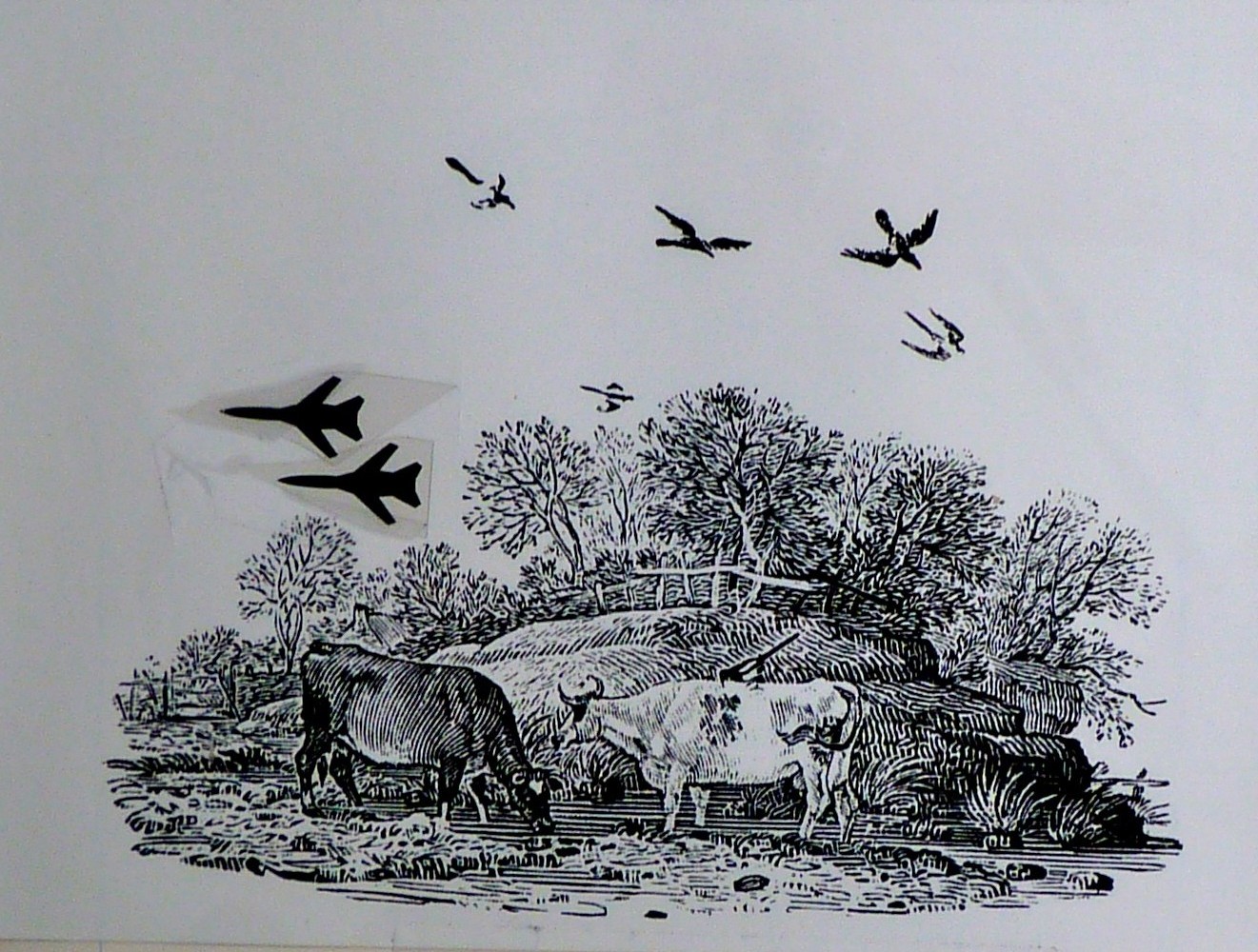
Above is the original artwork for one page , an eighteenth century Thomas Bewick engraving disrupted with a photo-montage of two fighter planes, which hangs on my wall.
In 2003 David Gentleman designed march placards for the Stop the War Coalition combining a bloodstain motif with the single short word ‘NO’ to make a poster with the economy of a postage stamp, but this time intended to be read in a single glance and at a great distance. It is rare gift to be able to think so cogently in words and images.
all images : copyright David Gentleman / bibleofbritishtaste.com
and with many thanks to Sue and David Gentleman.
I love the house of the Gentleman’s. I aspire to have a kitchen like theirs, I think they can only be inherited. And I have a small collection of the Concorde stamps that I will get around to having framed one of these days!
I am happy to have discovered your blog. I am very interested in interior design, but find that over designed houses don’t make people feel as comfortable as interiors where not everything seems to be thought through and controlled, where the esthetic rule is not overpowering. I have subscribed and look forward to new posts. Best,Katharina
Came across your fantastic site after buying some David Gentleman stamps on ebay,your posting on the home was very useful. oh dear looks like I will be on the internet all day catching up on your postings. Thank you, love the site.
Just discovered David Gentleman via Elle Decor. My new crush! I love his art and his house. And I love that it led me to your site.
I enjoyed this web site very much! When my husband was getting his PH.D. from Manchester and I was teaching violin for the Bradford Council the Wedgwood plates with David Gentleman’s art what what we bought (one at a time) for the wonderful memory of our four years there. On this side of the pond they are still cherished.
My Very Best Wishes,
Jann Sparks
Wonderful home and stunning work.
I love your instagram posts and have just come to your blog so I’m hopelessly out of date here but I’m pretty sure Edward the Second’s wife was Isabella of France.